Serif or Sans Serif for a Printed Page?
Serif or sans serif for a printed page? Compare type on the intended paper to choose a face that stays clear, fits the layout and suits its readers.
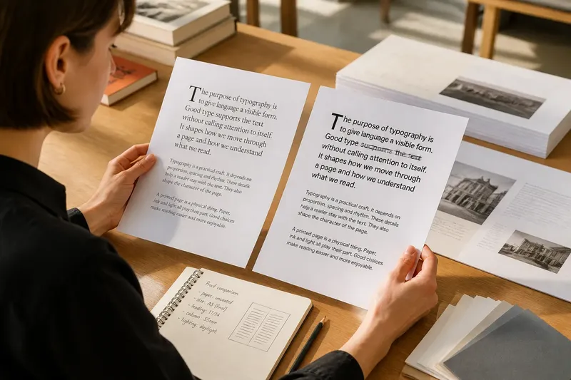
Serif or sans serif for a printed page? The useful answer comes from comparing the actual type on the page readers will hold, not from a rule about which letters are easier. A font that looks calm on screen can turn crowded in ink.
The choice is not simply whether letters have small strokes at their ends. Serif and sans serif fonts vary in proportion, spacing and weight. Compare them in context, and you have a better basis for choosing than a genre convention or a passing preference.
Set reading conditions
Before opening a font menu, establish what the page needs to do. Is it a continuous essay, a compact programme, a manual with frequent headings, or a report readers will consult rather than read from beginning to end? Length and structure affect how much sustained reading the type must support.
Note the page size, column width, paper stock and likely lighting. A narrow column creates frequent line breaks; a broad one can make it harder to return to the next line. Uncoated paper may soften fine details, while a glossy surface can reflect overhead light. These conditions are reasons to compare carefully, not to rule out a whole category.
Check the production route, too. A local digital printer may render fine strokes differently from an offset print job. Ask the printer about supplied profiles and font handling, and use the intended paper when possible. Type, page and reproduction process form one object. Judging any one alone is a reliable way to be surprised.
Compare letter shapes
Choose a small set of candidate fonts rather than browsing indefinitely. A readable serif and a readable sans serif are enough for an initial comparison. If the page uses specialised characters, check those too: numerals, punctuation, italics, accented letters and symbols vary within both categories.
Look at the lowercase forms that recur in prose. In serif designs, finishing strokes can distinguish shapes and give letters a more articulated outline. In sans serif designs, simpler endings can make forms feel open or direct. Neither description settles the question. Proportions, counters, joins and spacing matter just as much as the presence of serifs.
Check easily confused pairs, such as lowercase i and l, or c and e, in the actual text. Inspect an ampersand, a question mark and numerals if they appear often. A design that handles these details clearly may suit the page better than one whose general look first appealed.
Type specimens help identify candidates, but they cannot replace your own copy. Put the same paragraph, with varied punctuation and several long words, into each font. Otherwise, you are comparing different prose as well as different letterforms. A splendidly inconclusive exercise.
Build matching proofs
Set a short passage in both candidates. Keep the type size, line length, leading, margins and paragraph spacing as close as possible. Use the same heading treatment for now, and avoid decorative elements that might distract from the body text. Compare type, not the entire personality of a redesigned page.
Do not force the fonts to occupy exactly the same number of lines if their proportions differ. That difference is part of the comparison. Record how each fits, then adjust line length or size only if the real layout allows it. If one candidate needs visibly tighter spacing, decide whether that compromise is acceptable rather than hiding it in the proof.
Print at the intended final size. An enlarged sheet on a monitor says little about the relationship between the letters and a reader’s eye. Use the expected paper stock, or a close substitute, and review the sheet in the sort of light where it will be read. Keep a digital proof for line breaks; let the physical sheet answer questions about ink, texture and glare.
For a long page, inspect both a paragraph and a full spread. A short sample reveals letter shapes. A spread reveals the grey tone made by repeated lines, the pattern of headings and the white space around the text. The two categories can produce different page textures even when their individual letters look equally appealing.
Read texture and rhythm
Look at the page from normal reading distance before leaning in. Is the text block even, or do dark patches and gaps keep drawing attention? Do lines feel crowded? Can you follow a paragraph without the headings taking over? These observations concern the whole page, not an abstract claim about one type category.
Read a passage at an ordinary pace. Notice where your eyes lose their place, whether similar letters blur together, and whether line endings feel awkward. Try another passage with different words. A font may look comfortable in a paragraph of short words but become tiring around dense terminology, repeated numerals or long italic phrases.
Consider the reader’s conditions without turning them into assumptions about ability. Someone reading by a dim bedside lamp has a different task from someone checking a brightly lit handout while standing. Readers may also have differing visual needs. If the page serves a defined audience, ask representative readers to review it; their practical observations may catch what close inspection misses.
Contrast and ink spread matter as well. Very light strokes may lose definition in a particular print process; heavy strokes can fill small counters or make a page look dense. The question is not which family is theoretically cleaner, but whether the printed shapes remain distinct at the size and contrast the design uses.
Reader questions
Is serif type better for long print?
Not by category alone. A well-spaced sans serif may suit continuous prose, while a particular serif may feel cramped or delicate on the chosen stock. Compare the printed page, including its line length and lighting conditions.
Is sans serif clearer at small sizes?
Some sans serif designs have open forms that remain distinct at small sizes, but others have tight spacing or ambiguous shapes. Some serifs also hold up well. Inspect the actual font and printed size rather than relying on the label.
Should body text and headings match?
They can match, but a second typeface may create useful distinction if it does not compete with the body text. Keep the number of styles restrained and check that the contrast remains clear on the printed page.
What if both proofs seem comfortable?
Compare how each handles the full page, including fit, texture, headings and supporting details. If both remain suitable, choose the one that better serves the publication’s tone and production constraints, then review the final proof.
Choose a working combination
Use your observations to narrow the decision. Keep a candidate if its letterforms remain distinct, its texture suits the page and its layout fits without awkward adjustments. Remove it if it requires cramped spacing, loses important details in print or makes the page tiring to follow under expected conditions.
Set body copy first, because its line length and spacing govern the main reading experience. Add headings, captions, footnotes and page numbers afterwards. If you combine serif and sans serif, give each a clear role rather than alternating them for variety. The reader should be able to tell what the difference means.
Say you are laying out an invented community newsletter in a narrow column on slightly textured uncoated paper. You set the same article in a moderate serif and a humanist sans serif, keeping size, leading and margins alike, then print both at the intended size under ordinary indoor light. The serif’s fine strokes look faint, while the sans serif keeps its counters open and makes the lines easier to track. For this page, the sans serif is the better choice; smoother stock or a wider column could change the trade-off.
Check the final proof after all the content is in place. Late changes can alter line endings, leave a heading stranded or squeeze a note into an uncomfortable space. Review the page as a reader will encounter it, rather than trusting an earlier sample after the design has changed.
Keep the choice specific
Serif or sans serif for a printed page is a decision about a particular combination of type, copy, paper, layout and reading conditions. Note the font, size and spacing that worked, along with the paper and printer used. That record gives you a useful starting point for a related publication, not a rule to impose on every page. The most persuasive specimen is the one the reader can actually hold.