The Feature Wall Is Not a Room Plan
A feature wall cannot fix a room plan. Learn to assess sightlines, surface, light and pattern before choosing paint or wallpaper for a more coherent focal point.
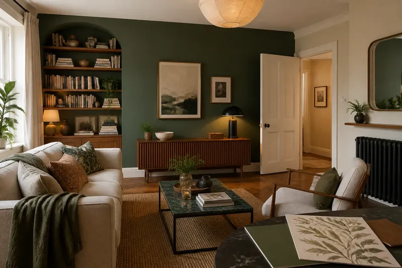
Which wall should carry the colour or pattern, and how can you tell before buying paint? For a feature wall, start with what the surface will look like from the places where it is actually seen. A strong finish can give a room a focal point; it can also compete with a television, disappear behind furniture or make a busy surface busier.
That is a question of visual composition, not a cure for a room’s arrangement. Focus on the wall itself: its shape, the light that reaches it, what sits against it and how it relates to nearby finishes.
Read the wall
Look at the whole surface, including interruptions. A doorway, radiator, alcove or large bookcase can divide a wall into fragments. A large-scale pattern may lose its rhythm around those breaks, while a solid colour can make the wall read as one plane.
Notice the edges too. A feature that stops at a corner has a clear boundary; one that wraps around a return may feel more continuous. Neither is inherently better. The choice depends on whether the room needs a distinct accent or a broader field of colour.
Check the wall from the main viewpoints: the entrance, the sofa or bed, and any place where people tend to pause. A wall that dominates from every angle may be more forceful than expected. A smaller section, such as the back of an alcove, may be enough.
Match colour to light
Daylight changes through the day, and artificial light changes the appearance of paint after dark. A cool grey can look bluer in one room and flatter in another. Warm bulbs may make a pale neutral appear creamier. Sample cards are useful for comparing undertones, but a small painted patch gives a better sense of how a finish behaves on the actual surface.
Place samples beside the skirting, woodwork and nearby fabrics. Look at them in both daylight and the light used in the evening. If a colour seems agreeable only when held against a white sheet of paper, that is not a particularly persuasive audition.
Finish matters as well. Matt paint tends to soften minor surface irregularities, while sheen can emphasise texture and reflect light. Follow the paint maker’s guidance on surface preparation and finish, especially where the wall has marks or uneven repairs.
Choose pattern scale
Wallpaper scale affects how a wall reads at a distance. A small repeat can create a fine texture; a large motif gives the eye a more obvious place to land. The pattern also needs room to appear. If a wardrobe or shelving covers most of the wall, the repeat may be interrupted rather than framed.
Compare the pattern with nearby objects. Striped curtains, patterned upholstery and a detailed rug can all ask for attention. They need not match, but differences in scale and contrast help them coexist. A quiet wall can give a lively textile room to breathe; a bold wallpaper may work better beside plain upholstery.
For paper with a prominent repeat, check the manufacturer’s instructions for pattern matching and ordering. Keep the product label until the work is complete, so any remaining roll can be identified if needed.
Questions about feature walls?
Does the darkest wall make the best feature?
Not necessarily. A dark wall can make pale objects stand out, but it may also absorb attention or feel heavy in a room with little natural light.
Judge it against the room’s furnishings and evening lighting, rather than treating darkness as a shortcut to drama.
Should wallpaper go on every wall?
It can, if the pattern and scale suit the room and its contents. A single wall is useful when the aim is to mark one area or introduce pattern without covering every surface.
Compare both options with samples before deciding; the amount of pattern changes the room’s overall character.
Can a feature wall hide an awkward surface?
Colour may draw attention away from minor visual differences, but paint and wallpaper do not repair damaged plaster or persistent damp. Deal with the underlying condition before decorating.
For a problem that may involve the building fabric, ask a suitable professional to assess it.
What if the wall is mostly covered?
Consider whether the visible area is large enough to carry the finish. A colour may still define the exposed edges, while an elaborate pattern can look chopped up behind furniture.
Use a sample or paper offcut in place before committing, and choose a simpler treatment if the pattern has no room to read.
Compare the alternatives
Say you have a pale alcove behind a bookcase, with a small area visible above and beside the shelves. You compare a large botanical wallpaper sample with a muted green paint card, placing both against the existing oak trim in daylight and under the room’s evening lamp. The wallpaper’s motif is mostly hidden by the bookcase, so you decide it would appear fragmented. The green paint remains visible around the shelves and sits comfortably beside the trim, so it becomes the more coherent option. That decision is about the wall’s actual composition, not a claim that one finish suits every alcove.
Before choosing, check these points against the particular wall:
- Check how much uninterrupted surface is visible; if little remains, choose a plain colour or leave the wall alone rather than use a pattern that will be obscured.
- Check for doors, radiators and alcoves; if they break up the surface, use a treatment that tolerates interruptions or focus on a separate, intact section.
- Check the wall beside nearby fabrics and finishes; if several patterns compete, choose a quieter wall treatment, or simplify one of the neighbouring surfaces.
- Check the sample in daylight and evening light; if its undertone shifts in an unwelcome way, try a different shade or change the lighting before committing.
- Check the wall’s condition for loose paint, damaged plaster or damp; if the surface is sound, prepare it as directed, but if a building issue is suspected, pause and seek professional advice.
- Check the manufacturer’s wallpaper instructions for repeat and matching; if the pattern requires more careful alignment than the wall or your skills allow, select a simpler repeat or use a qualified decorator.
Make the finish fit
Paint, wallpaper and exposed materials create different kinds of emphasis. Paint gives a relatively continuous field of colour. Wallpaper adds pattern and surface detail. A material such as timber panelling brings texture and visible joints, so its edges and relationship with existing woodwork deserve attention.
Consider the room’s existing palette before adding a new one. Repeating a colour already present in a cushion, curtain or artwork can make the accent feel connected. A contrasting colour can be deliberate too, but it should have a clear relationship to the other finishes rather than arrive as an unrelated announcement.
For rented homes, check the tenancy terms before making a lasting change. For work involving fixed elements or a surface that may conceal a building problem, get appropriate advice before proceeding.
Keep the choice specific
A feature wall works best when its material, scale and position suit the surface it occupies. The main search for a feature wall need not begin with a fashionable shade: look at the interruptions, test colour in changing light and judge pattern beside the objects that will remain in view.
One final check is to remove the sample before making a decision, then look at the wall again. If the proposed finish still has a clear reason to be there, it is more likely to support the room’s character rather than merely occupy its most convenient blank patch.